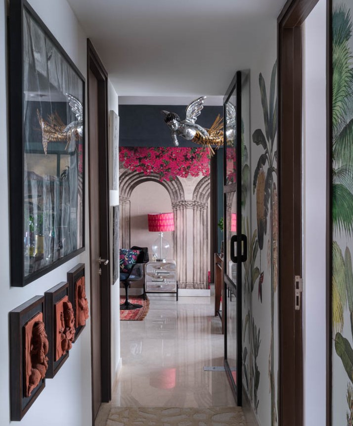
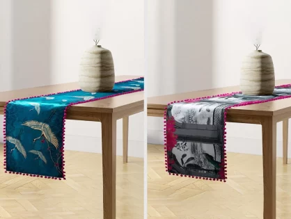
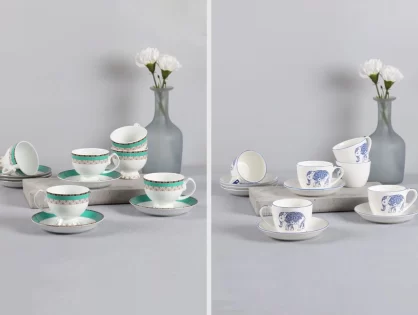
Krsnaa Mehta, India Circus – A Godrej Venture’s Creative Director & Founding Partner’s home is a rendition of visual poetry with eclectic charm and a haven of color palette. He gets his lego pieces together to simplify yet create a slice of heaven. Punctuating the busy streets of Bombay, this 52nd floor South Mumbai home celebrates nature, art and vibrancy of India in every corner. With his designs and creativity, he walks us through the inspiration, the memories and how simple it really is to put together a heaven of your own with minimal effort.
Thank you for reading this post, don't forget to subscribe!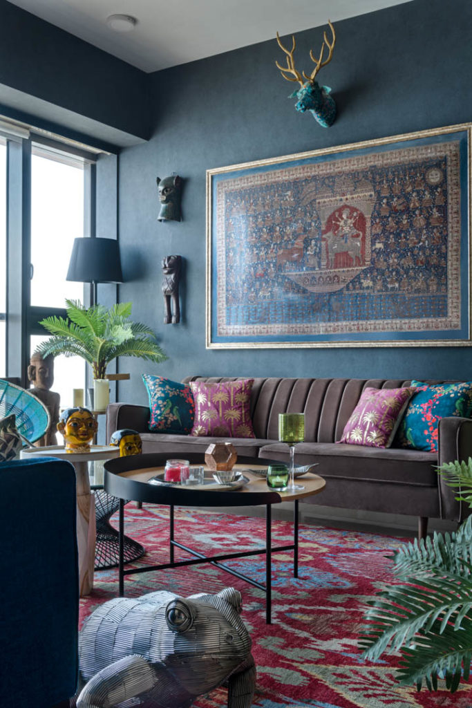
1. Where does your passion and inspiration on design come from?
“My passion and inspiration stems from India and its unending creativity and beauty in chaos. Ever since I was a student and studied in America, I’ve always wondered why people were not inspired by this country enough to create a signature design. Hence several years ago, I embarked upon this journey of contemporising Indian design and Indian crafts… today we are where we are.”
2. What were the design objectives while doing this house?
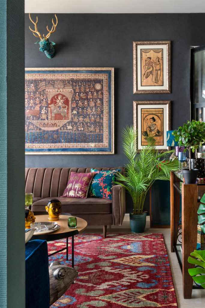
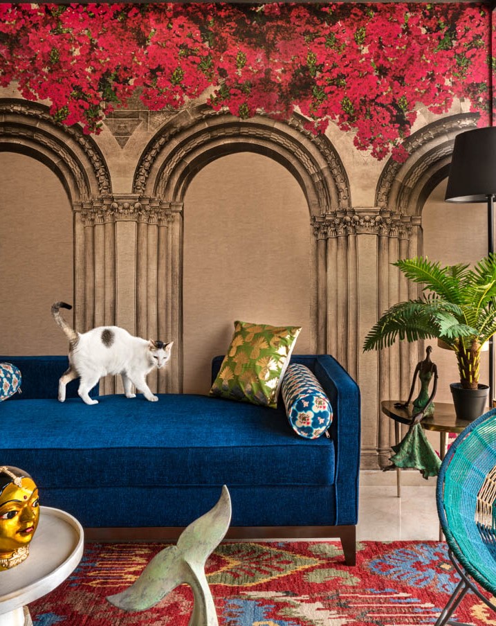
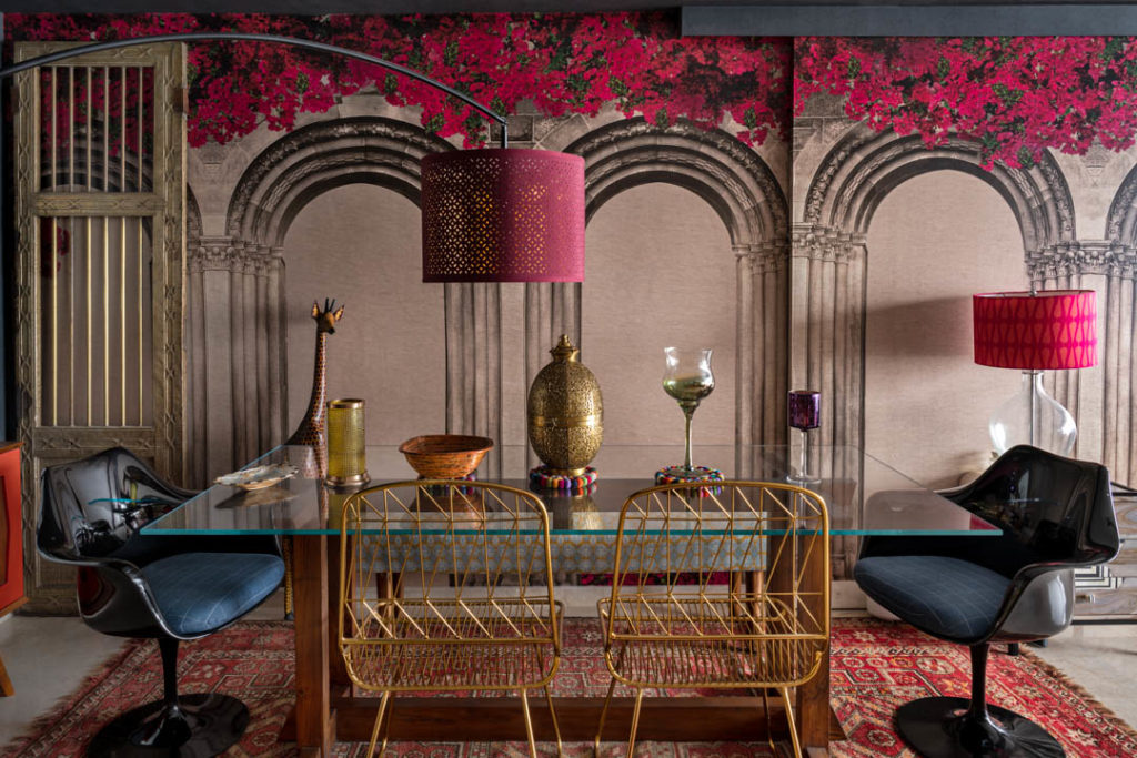
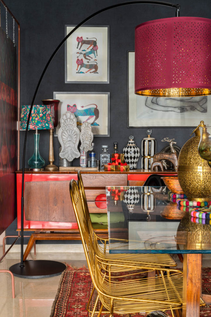
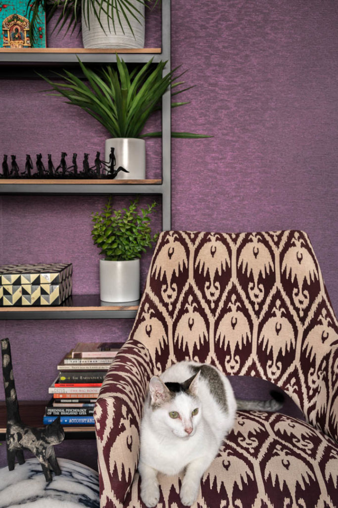
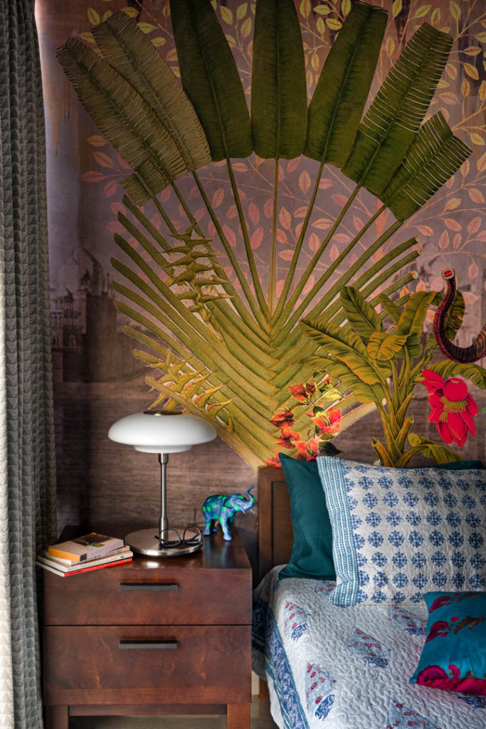
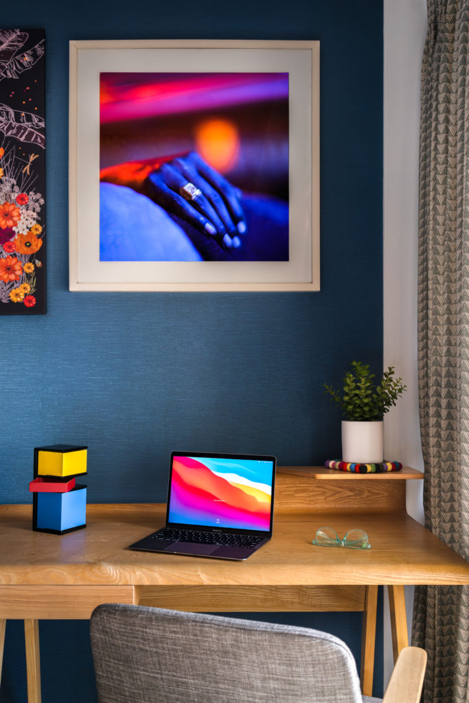
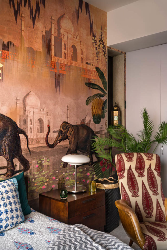
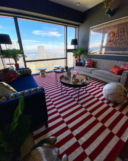
“My main objective was to go a notch up from the previous house in terms of the experiences and play around with art and motifs which I had not done earlier. I intentionally chose a deeper color palette for the walls this time so that they will pop against my wallpaper designs. I avoided bright colors for the walls, because I wanted the journey to look more evolved. All my art, artefacts, wallpapers, etc compliment well against the deeper tone wall colors beautifully. In fact, I did one of my walls black so that absorbs the reflection completely and makes the space look larger. The idea is to play with colors and textures that is a reflection of your taste, yet not overpower anyone visiting or coming into your space.”
3. Which corner would be your favourite and why
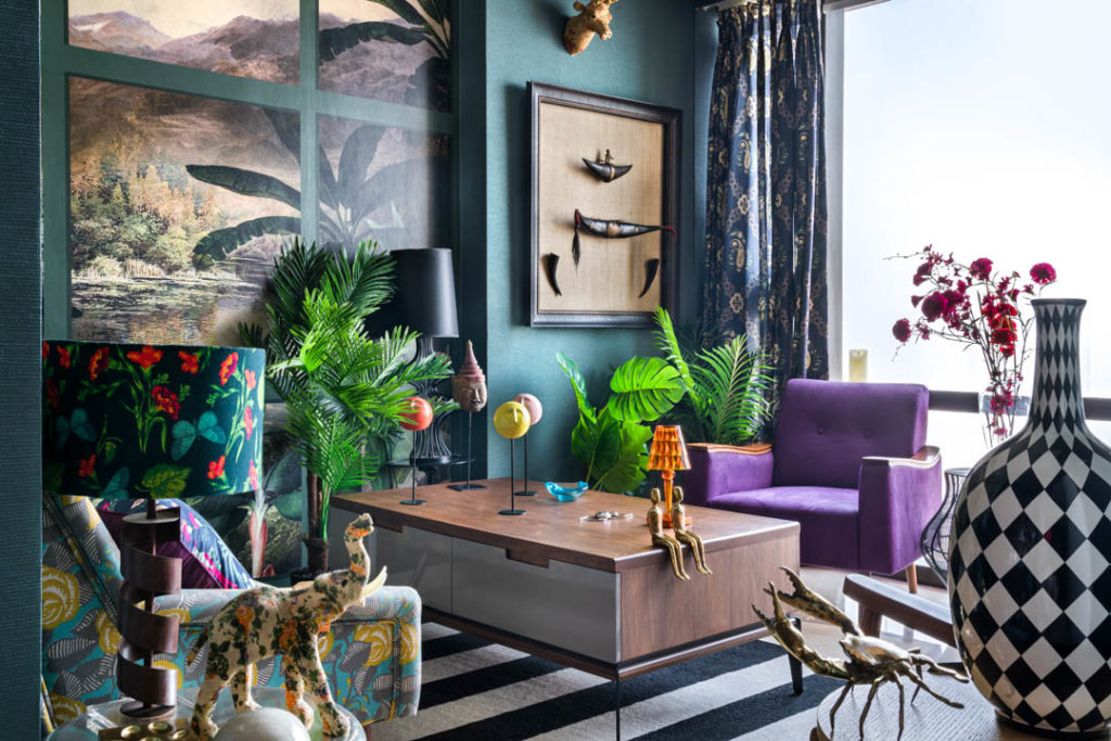
“The most favourite corner in my house is what I would call the ‘Den room’, or the Party room, which is where I entertain small groups of friends. It is a very cosy room and is an extension of the living room. It makes for the perfect space to have interesting conversations that could go on till the wee hours of the morning. It has a bit of everything…the view, the wallpapers, artefacts, colors and warmth!”
3. What was the biggest challenges you faced while doing up your house
“The biggest challenge while doing up the house was essentially that being a new building it came with a pre-set flooring and pre-set dimensions for all the rooms so although it is a large 4 bedroom space, I still felt I needed to expand the living room so I had to break one of the walls of the first guest room and make that a part of the living room.
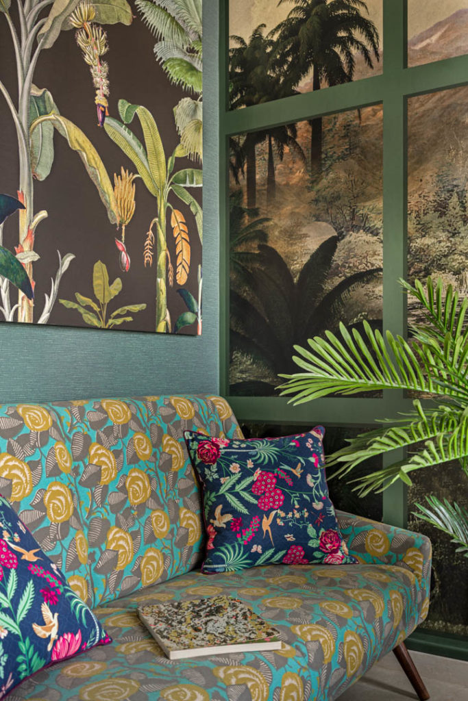
Other than that, I felt that while the house offers a magnanimous view outside, I had to create a worldly spectacle inside as well, in every room, every nook and corner and in every passage that connects the rooms. It ought to be a space that exudes my sensibilities, intimacy and charm, all in one”
5. Please describe any unique feature that your home has or a theme you followed
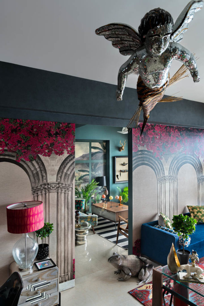
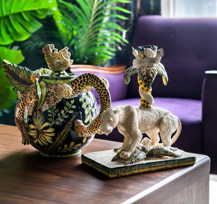
“I think the most unique features in my house are the images, the merman installation on the ceiling, the Ardmore kettle with a leopard and a forest-y hand painting on it. Also, there are many artefacts and works of art that I have been collecting over time which I could finally put on display in this house and create this magical India journey. It is like a walk through of art, artefacts and of course, India Circus and all my textile products.”
6. What makes it a signature “Krsnaa Mehta home” and how does one go about doing this for our own homes if one has to…
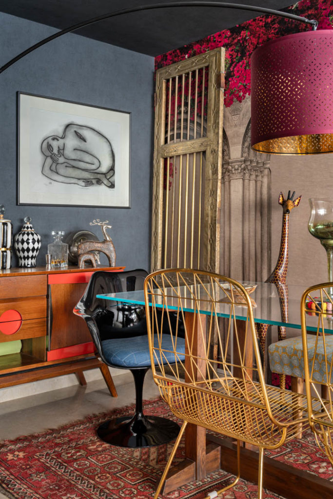
“It is certainly the fact that it reflects my personality, and I think from a “Krsnaa Mehta” point of view, if I do somebody else’s home it would not be my personality, it would be my personality in complete conjunction and mirroring the personality of my client.”
7. Any design trends to follow for this year and any you may have incorporated in your home?
“I don’t follow trends…I believe in lasting timeless fashion. And that is synonymous with the work I do in terms of my inspiration. I could talk about trends in terms of wall colors and wallpapers and other elements. I think the biggest trend to me, and an advice to you as a reader would be to mix and match as much as you can, it makes the space far more interesting.”
8. Your apartment is proof that there is no such thing as too much color. Any do’s and don’ts while designing?
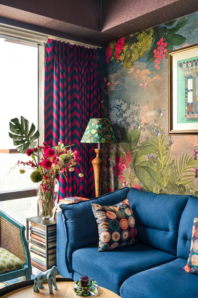
“I think this question is very important for people who do not have the experience of the psychology of color or how to know which colors reflect with light & shadow etc. It is very important to either work with a color expert or to understand how colors need to be within a home. I have seen some disasters where people have tried to copy my style and it has not worked. The right way is to know what works in the overall environment and by balancing the colors and tone… also knowing what your house is going to look like by day and by night.”
9. Your wall arts give the space a very unique look. How do you curate and create this artistry?
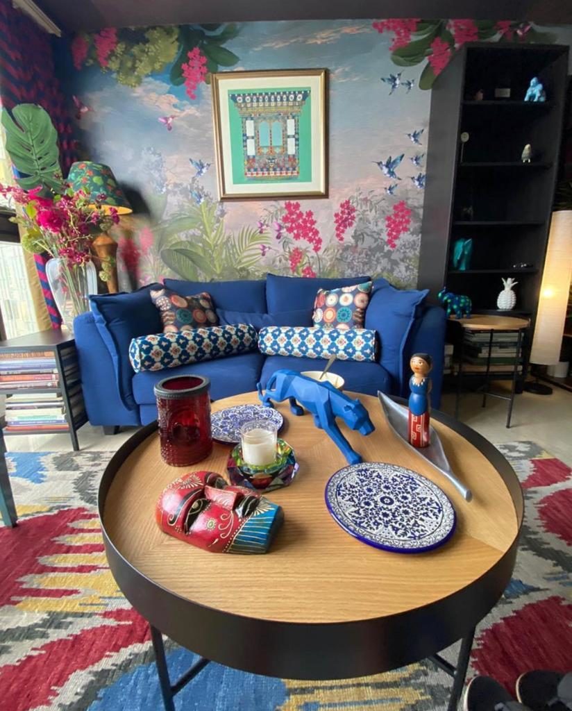
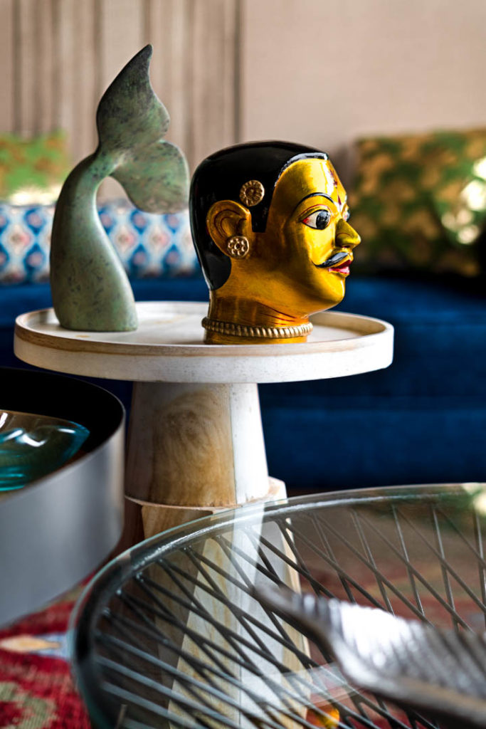
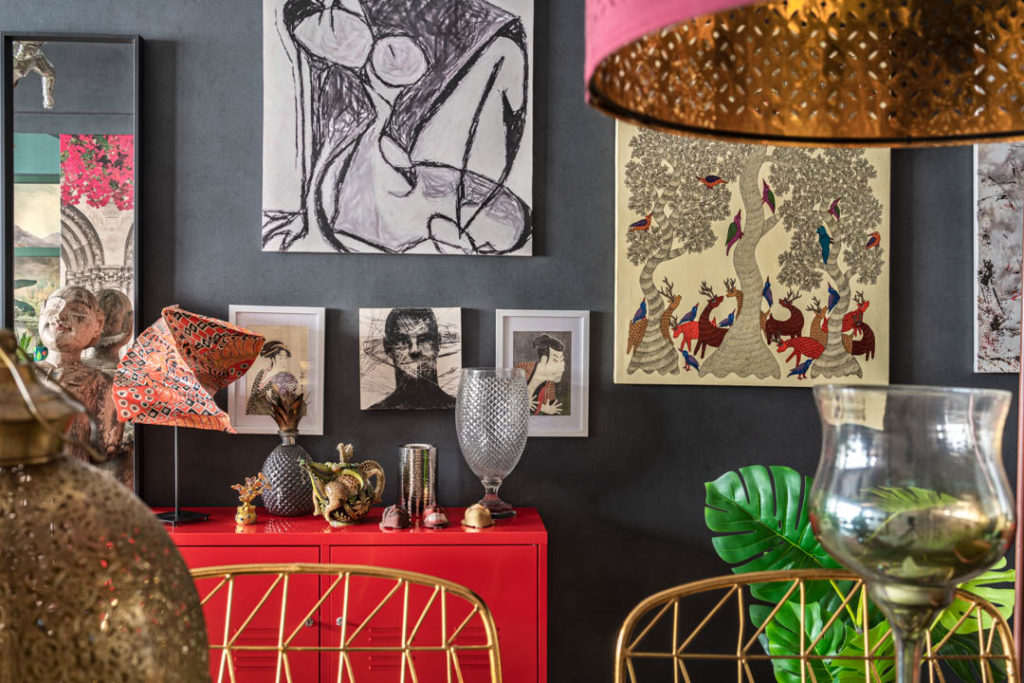
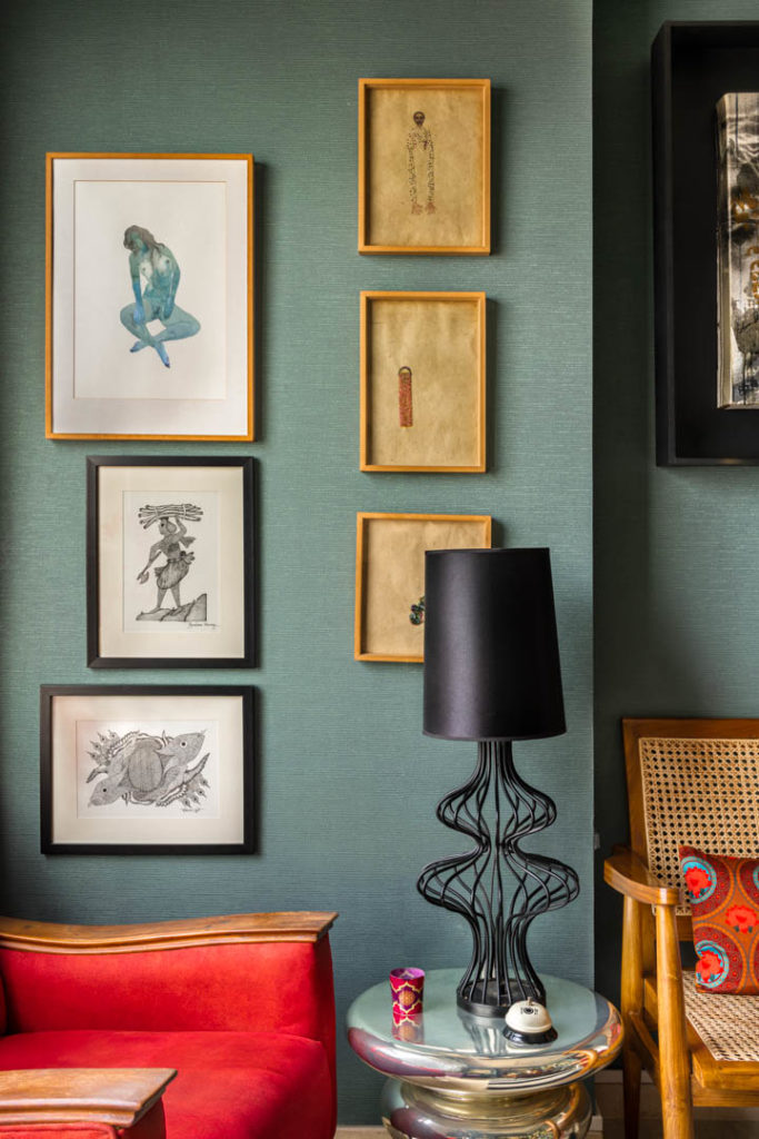
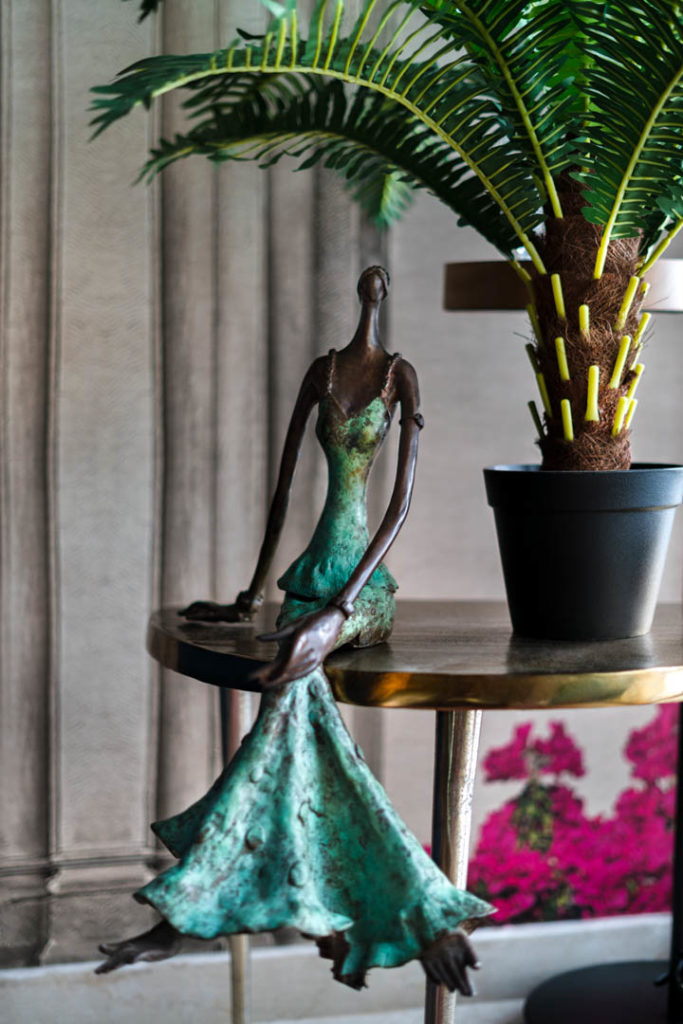
“I have created the house as if you were to be on a journey of art and artefacts ….a home that is perfectly in sync with the bronze lady and the merman and of course other things around the house where it sort of ties in together. It creates this experience like a modern India escapade. At the same time, it also has a western touch like some of the lamps and lights and a lot of emphasis on art which I have not done in the past. I guess as one grows older one tends to appreciate more things, but it is important to have a nice assortment of beautiful mementos from one’s travels and it’s always worth it!”
10. Do you think a home becomes more valuable when you incorporate a personalised curated home bar in it and what aesthetic value it adds to your home?
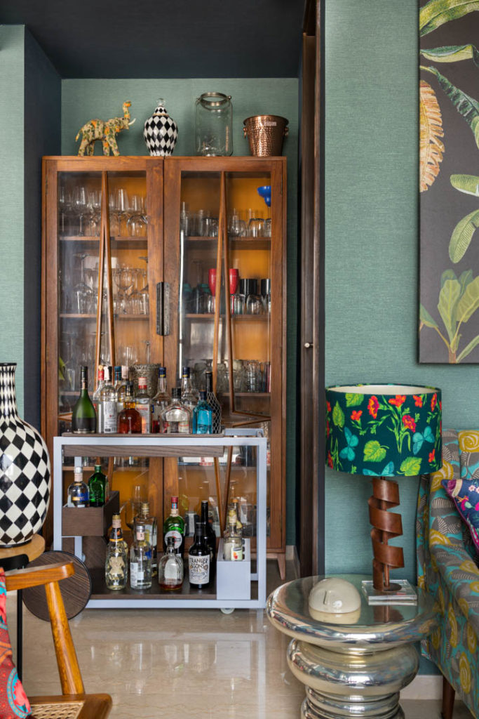
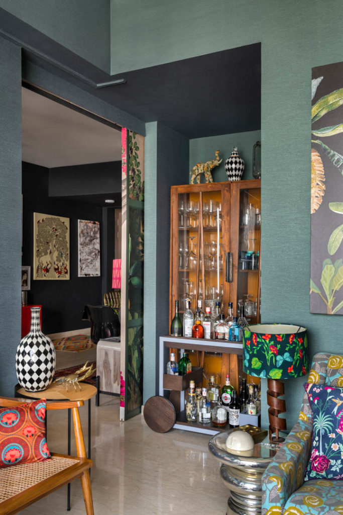
“I think a home bar is nice. A home bar can be a trolley, it can be a shelf, it can be a bookshelf or even a corner of a sideboard. It is really just how you want to present yourself to your guests and how you want them to experience ‘an evening out of warmth and conversation’. So I, for instance, have a trolley but at the same time I leave things like bottles of wine, etc. on the table so that it’s easy for people to serve themselves. And of course, there is another part of the house where there is an ice bucket, etc. So when one is entertaining, one is not cramped for space. There’s enough space to keep one’s liquor, glasses and ice, etc. At the same time, I think a trolley is the nicest idea because it’s mobile and you can prepare it just for the evening and then disassemble it when you call it a night.”
11. Have you thought of a name yet for your home? If yes, what is it?
“In a show that I watched, they have portrayed ‘after death’- the heaven to be these splashes of color in all things. What I mean to say is, heaven in a sense is described as the Holi festival like this burst of colors and most people who’ve experienced it, have only seen it. So, I feel what we do with ‘India Circus’ and these houses are that we’re giving people literally a piece of heaven, which I thought is quite interesting. Hence, if I were to name the house, I’d call it, ‘A Slice of Heaven’ or ‘The Magic of India’.”
12. You recently shifted homes. What anything upcycled or recycled that one can take inspiration from?
“I love the idea of recycling and upcycling. I also love the idea of saving things for future homes or more so my second home. I have tried to use as much as I could from the previous home but one must realise this is a bigger house and I’ve had to create more pieces of furniture. If you see the furniture with India Circus and my co-brand Godrej -Script elements, both are so inherently different, with the fusion of the whole thing from a modern sofa to a bronze statue for instance or a standard gold plated statue, the journey of each is quite interesting, and everything sort of works together because of the tonality of it.”
13. Are there any artefacts or artworks you have picked up from your various travels?
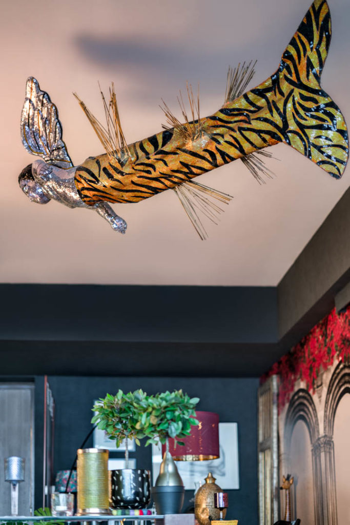
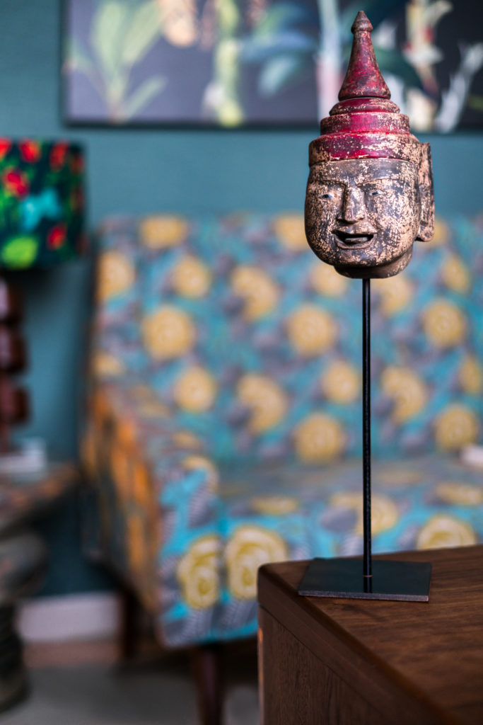
“Yes, my home is a kingdom of artefacts and artworks from almost all over the world- Russia, Africa, Indonesia, Cambodia, Thailand, Morocco, Seychelles, Sri Lanka, etc.
14. A color palette that is your favourite?
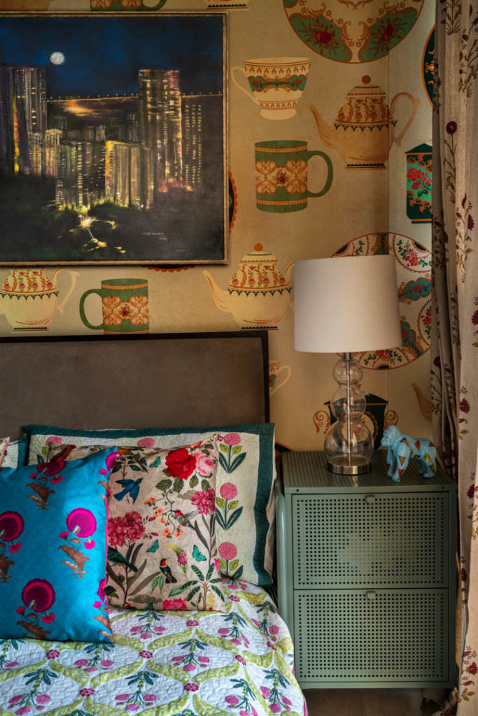
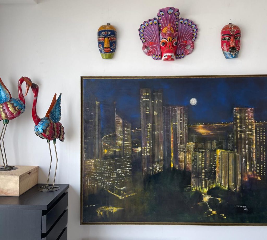
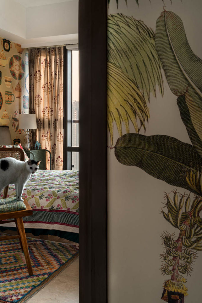
“In the color palette, I love the word burnt. I feel burnt is the new best thing because you take a simple tone, like in the bedroom if you see the wall is a greyish blue so I called it a ‘burnt blue’. What happens then is that you can tone down colors and make them more sophisticated versus just having a sky blue or bright blue. So, when you see the house and you see the pictures of the house featured here, you realize that from the burnt blue in the bedroom to the, burnt leaf Green in the party room and to the burnt lavender in the TV room you’ll see that the tones are deep, and they create a sense of coziness in the space.”
15. Do you think the view from the house is important for a better experience of the interior?
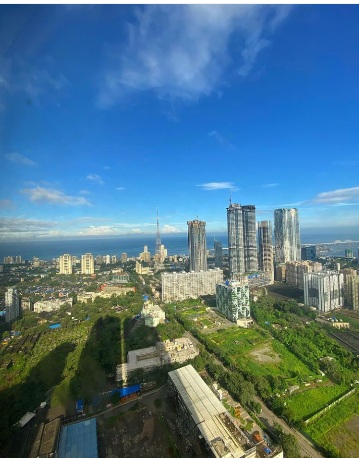
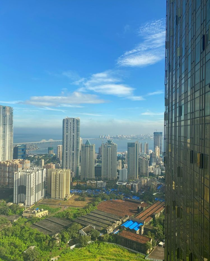
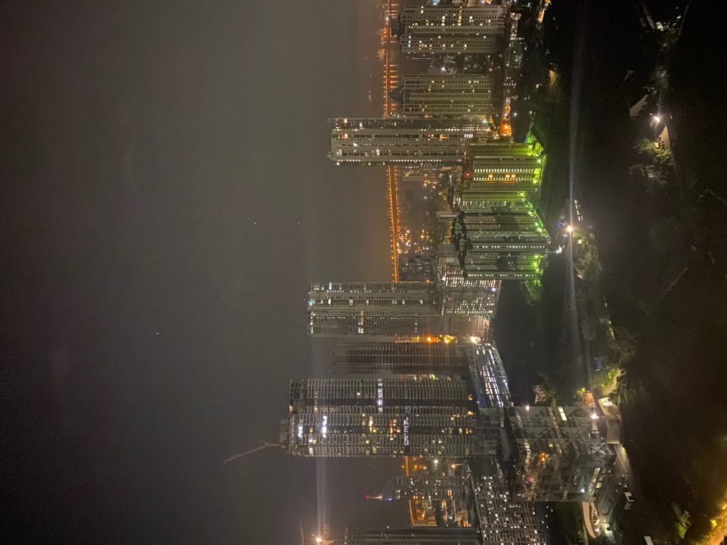
“Personally, I think it’s a cherry on top. Specifically for this home, the view is mesmerising! We tried taking pictures one day where the city was foggy but yet it looked soul satisfying. You could see in the images below that a view like this isn’t easy to capture and it looks exotic! Of course nature is the art of God that adds the extra oomph to the interiors. It’s a win-win situation from the outside and on the inside.”
16. Five must-haves for the coming summer season in your home now
“The summer season must-haves would firstly be a range of copper products. Also secondly, a splash of cushions never hurt anyone. Thirdly, to have interesting cocktails in your bar! Gin is a big thing, one can always infuse Gin with all kinds of flowers and make the most delicious cocktails. Fourthly, minimal use of white color within the space because it tends to reflect a lot of light and also makes spaces look smaller on the contrary so why not experiment with nice wall colors and use our signature wallpapers, at least in two parts of your homes to create an outstanding surprise experience for yourself as well as your visitors.“
Images by: Fabien Charuau
