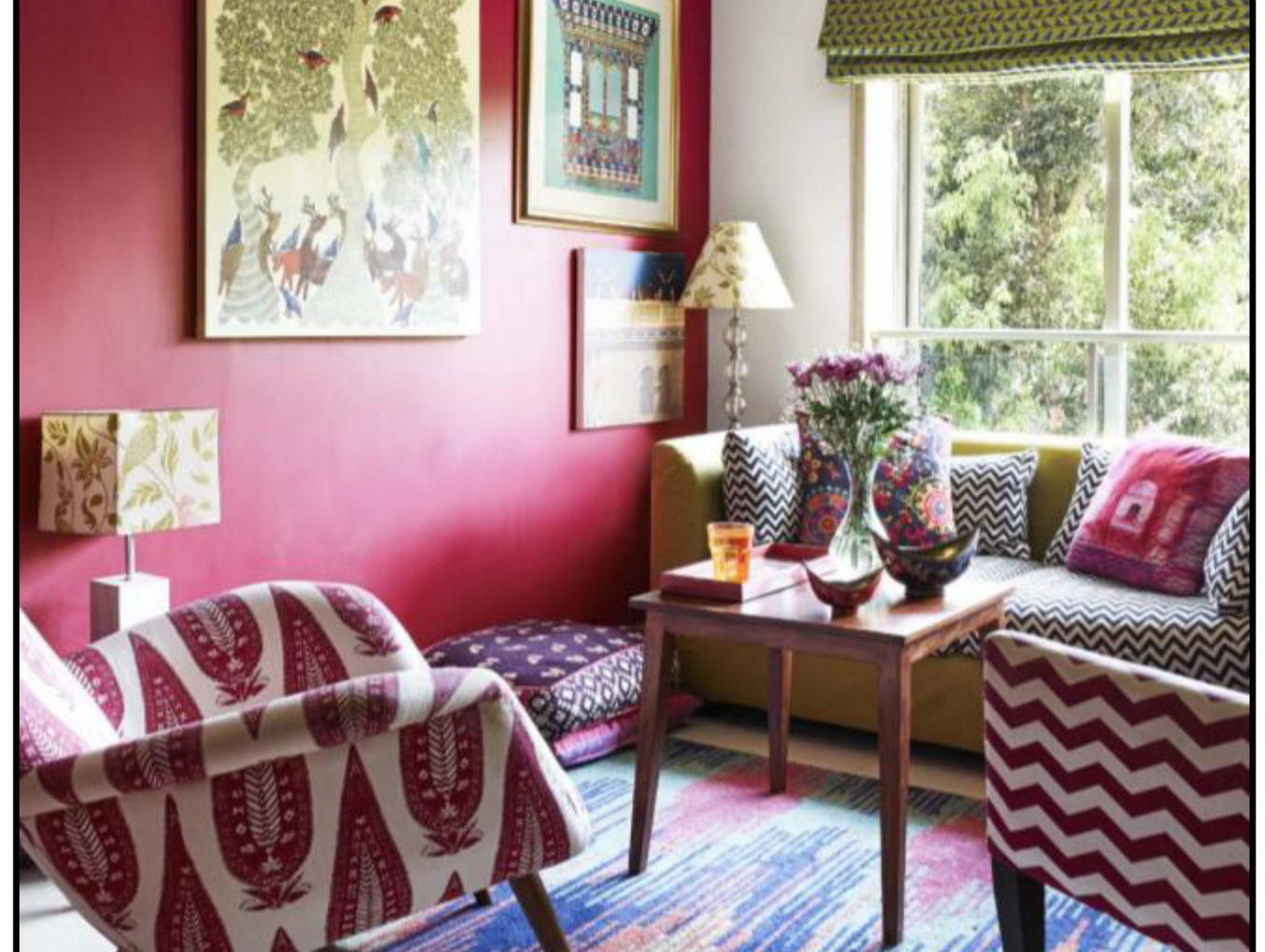
Our homes are where we spend the most of our time and are an extension of ourselves and how we decorate it becomes a part of our personal identity. They’re a gathering space for our loved ones and a space where we can just be ourselves.
Thank you for reading this post, don't forget to subscribe!Home decor is about a lot more than just furniture and accents . Currently the interior design trend that is everywhere is primary colours. Primary colours are clear, straightforward and bold and are often seen in modern designs , they can help us create the illusion of a bigger or smaller room . These colours can also affect our moods and state of mind as every colour invokes a different emotion.
Primary colours are Red, Blue and Yellow and they are the foundation of all other colours. While you may notice various shades and tones of primary colours in decor. Coming across these colours in their true form is often rare ,but adding bold and bright colours can be done in a way that’s sophisticated and subtle.These bold colours need to be added in pops rather than swathes
To help incorporate primary colours into your space there’s a basic concept called color theory which can help provide an understanding of how different shades and tones of colour can be used in various parts of your home.
The colour wheel which is a part of colour theory is divided into warm and cool colors. On the cool side of the wheel are shades of green ,blue and violet moving from bright green to blue green, through ocean blue and cobalt and on to purple and violet. The colours of red , orange and yellow are considered warm colours because they are the colours of fire. These hues are also said to advance ,meaning the walls appear to come forward and feel closer and are most often used for upholstery to make a room feel cozy🥰.
Here’s a guide on how to incorporate this bold trend into your space :
- Accent Your Space
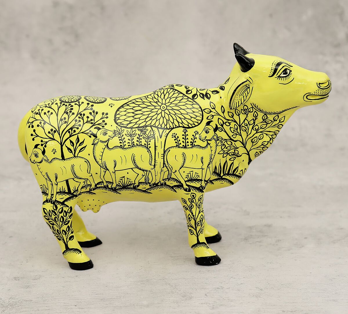
A simple and effective way of adding a primary colour to your space could be with simple accessories if you’re not ready to make a bold switch just yet. Adding a bold accessory like this animal figurine will stand pretty wherever you place it and command undivided attention from your guests.
- Opposites Attract
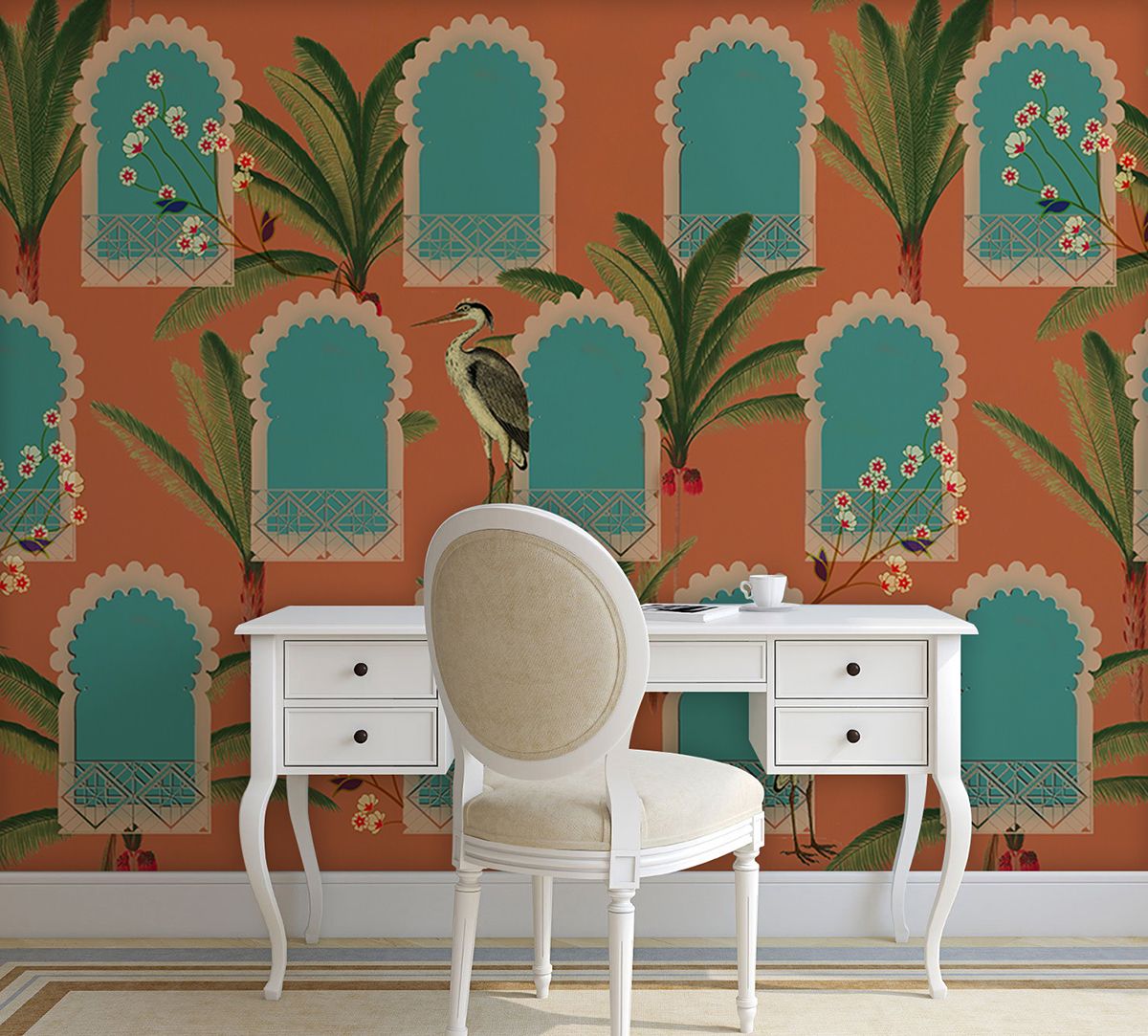
Pairing complementary tones like a bright vivid orange along with a cool blue can be very intimidating if you are unsure how to handle bold colours, but the trick is knowing how to use them in the right proportion. These schemes are bold and dynamic and are capable of creating some stunning spaces.

Incorporate this beautiful wallpaper into your abode The artistic representation of Mughal-styled windows in a splash of orange and blue with a heron looking at it adds an inviting element to your space to make a statement without it hurting your eyes.
- Tonal Treatment
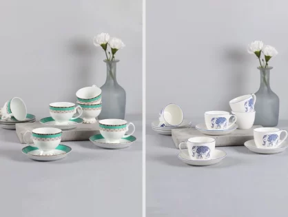
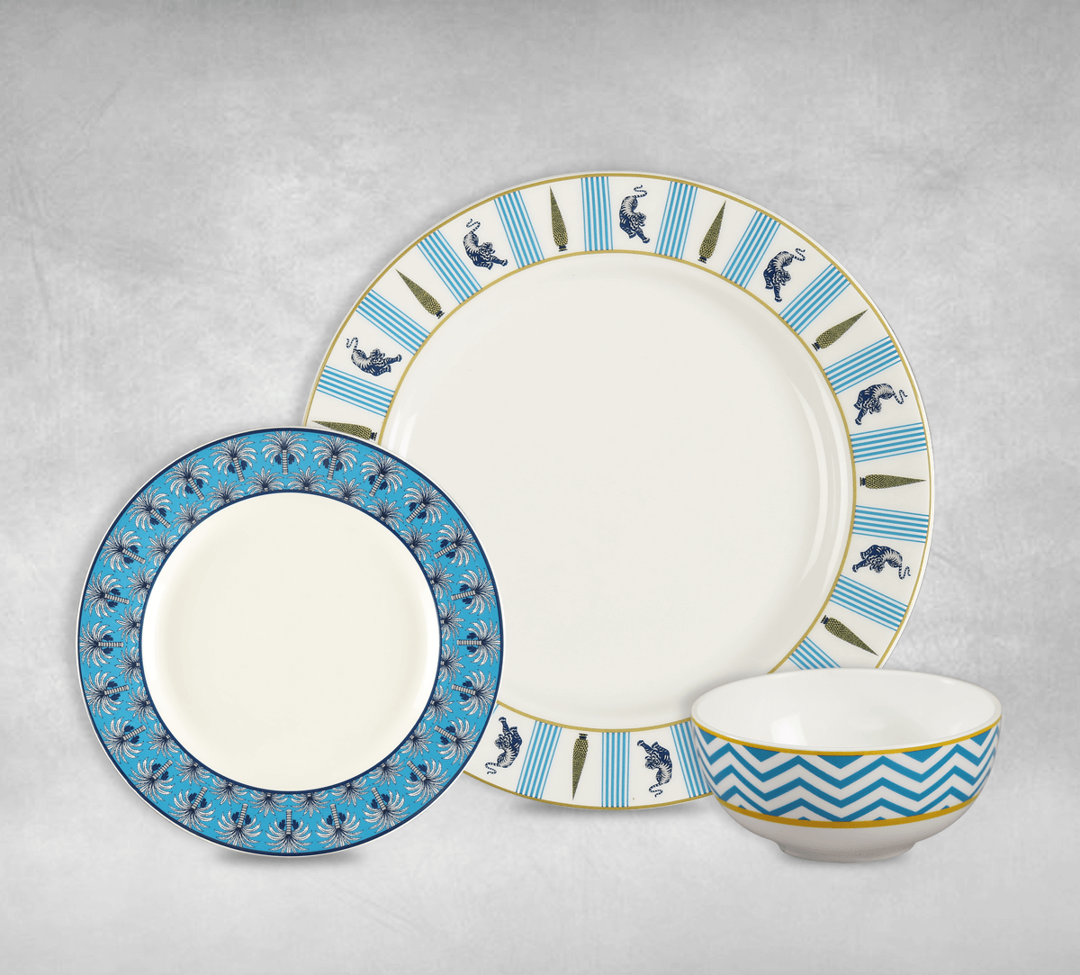
Choose one primary colour and stick with it. Incorporate this one colour throughout in various tones and shades to add depth. For example, taking your base colour as blue and mixing things up with various textures like this stunning dining set is a perfect way to add an Indian touch to your dining experience. The design on the dinner plate features alternate motifs of a jaguar, conifer and a floral design blending in light colours. Meanwhile the quarter plate lends a folklore feel with its floral reiteration in a subtle blue hue. The bowl with chevron artwork completes the look of the set.
There are several ways to go about selecting the way to incorporate the primary colour scheme into your abode. Start slowly when designing with colour for the first time , picking a colour that works well for your space. Pay attention to what our space is telling you and tone up or tone it down the colour accordingly to enhance the size of the room.
